Time to Paint!
Another year, another Bird Watcher’s Digest cover. My 18th, I think. Maybe 19th. I’ve been painting covers for this wonderful magazine since 1986. Yow. That’s a long time.
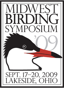
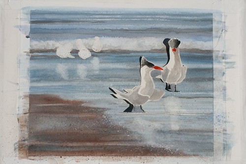
This was to be a special painting, one to mark and commemorate the fact that Bird Watcher’s Digest is hosting the Midwest Birding Symposium Sept. 17-19 in Lakeside, Ohio. The Caspian tern is the Symposium’s logo bird. The last time BWD hosted the MBS at Lakeside, Phoebe was very sparsely furred, pot bellied and little enough to sit under my French easel and arrange my paint tubes by color, and stay happy that way for a long time. Liam wasn’t even here; he was just giving me a distinctly Hitchcockian profile. Now Liam’s nine going on ten, and Phoebe is 14 going on 25. I remember the Bird Watcher's Digest-hosted Symposia of 1997 and 1999 as the most fun I’d had in a long time—so many of our friends from the bird world came and hung out. The weather was divine, the setting was Victorian and gorgeous, the speakers were top-notch, the birding was great, and Bill and I were excited to share our little family with the world, even though as a primary organizer he was running around like a crazy man, walkie-talkie in hand, making it all fall together for the nearly 1,000 participants. That was where I first held a Swarovski EL binocular in my hand and said, “If a pair of these drops down from the ceiling of the delivery room when Liam arrives, I won’t need any Demerol.” And I didn’t, and I got my binoculars and my sweet boy.
I wanted this painting to somehow capture the excitement and sense of camaraderie of the Symposium. I also wanted this cover to be different, looser, more fun. I was determined not to tighten up and get all picky. I was happy with the last one (The Missing Pane), which featured my orphaned eastern Phoebe, Luther. But I wanted to push it farther into the loose, slightly sloppy world of watercolor. I’m a watercolor painter, and at the half-century mark, I’m pretty sure I’ll never be anything else. I just love it. I fall back in love with it every time I pick up a brush.
A BWD cover demands that there be something of interest on both the front and back of the magazine. Of course, the main area of interest needs to be on the front cover, but I don’t want to neglect the back, either. There needs to be room for blurbs and the masthead and the UPC code…it’s a lot to think about. In the end, though, I didn’t want a painting that looked like it was engineered around all those little necessities.
I wanted strong horizontal and diagonal lines, and I wanted the birds to be bathed in light—that most of all. Here’s the sketch, which is actually pretty well realized, with the direction of light already worked out.
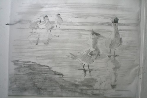
The thing about watercolor is that it’s fast. So fast, in fact, that I had already masked the birds with film and liquid masking compound by the time it occurred to me to take a photo. I had already put in the surf and sand flats. I had already made my paper dolls of the cover birds, cut them out, and stuck them to the painting so I could see how their colors would work with the sand and water I'd painted. See how the cutout bird is casting a shadow? It's stuck to the painting with tape.
I’d already started figuring out where the reflections were going to go and how they would look. Whoops. Well, that just goes to show you that sometimes life takes precedence over blogging. Lately it has taken a LOT of precedence over blogging, and that is a beautiful thing.
Next: Birds and reflections.
Labels: Bird Watcher's Digest, Caspian terns, Midwest Birding Symposium, Swarovski binoculars, Watercolor painting

posted by Julie Zickefoose @ 2:15 PM
![]()