Thursday, August 13, 2009

Caspian Terns--Finished

It's time for the last installment in our little painting class. Watercolors go pretty quickly!

tern7

Here, I’m playing with bounce light on the birds. I want some of the mauve and pink tones from the underlying sand playing up on the birds. They’re standing in shallow water. I figure the sand colors just under the water’s surface would be bouncing up on their underparts. So I feed mauve and pink into their bellies and underparts. This helps tie the bright red bills into the painting and keeps it all from looking too sterile.

I lay the tracing paper outline of the magazine cover over the painting to make sure it’s all going to work with the text. Looks OK.

tern9

Once again, I was flying, and unwilling to stop long enough to photograph the birds as I worked

on them.tern8

By now, it's almost evening, and the light is gone, but I shot a photo anyway. It looks blue, but don't worry--I haven't taken a blue wash over everything.

I’ve gone with a Billy Idol ‘do for the forward-facing bird. This is a pair of birds who are greeting each other with extended wrists and erect crests, something Caspian terns do. Howdy. Nice hair. Right back at ya. Ak ak ak ak ak.

To get the strong sidelight I wanted, I had to really play up the shadows. I adore painting white birds, and terns in particular, because white is such an expressive slate on which to play with subtle colors. It’s amazing what you can do to it and still have it read as white.


tern13

For instance, I decided that those shiny red bills would probably be sending bounce light onto the birds’ necks and breasts, so I went with that, sending a pinkish glow down their throats. Why not? If you can’t be playful when you paint, why do it?

I think I’m done. Gotta quit before it all gets too picky.

tern14

I hope you've enjoyed seeing this painting come to life.

If you'd like to order a signed, limited edition print of Sidelight: Caspian Terns, click here. And click on Limited Edition Prints.

I will sign it for you, inscribe it, and send it to you. I hope that this series has inspired the painters and dreamers. I know you're out there.

Psst. Just DO it! Paint, I mean.

Labels: , ,

Wednesday, August 12, 2009

Caspian Terns Part Two

We're working away on the Caspian tern painting. I have nothing pithy to say about how I painted the sand and the ocean. I just did it, painted things wet on wet in stripes and painted right over the masked out birds with great abandon and speed. When the paint dried, I could peel up the masking film and rub the dried masking compound off with my thumb and bingo! clean paper where I could paint the terns. Truth is, I couldn’t have stopped to take a photo if I’d wanted to.

While things were still wet I scrubbed out the reflections of the birds, which means I took a brush loaded with clear water, laid that water down, waited a few moments, then did a light scrub with a dry flat brush and just lifted the paint back off the paper.

tern3


But here’s where it gets tricky. For their reflections, I had to paint the same three birds, but upside down. Urggg. I tried it on the leftmost tern, tried drawing the durn thing upside down, and it was hard, even when I turned the painting upside down, to draw a convincing reflection. I decided I'd better figure out a better way for the next two birds. So I took a piece of tracing paper, traced my birds, and then flopped the image down on the painting and transferred it using soft pencil applied to the back of the tracing paper. By pressing down hard, I could make pencil lines on the watercolor paper.
In this way, I got an exact image of the bird where the reflection should be. Cool, huh?

tern4

This is the kind of thing you figure out on the fly when you’re painting. It was something that I knew I’d have to suss out, but I had only the haziest idea how to tackle it when I started the painting.

tern7

Here’s a detail. You can see that I’ve got the reflections of the loafing birds pretty well done. Note the leftmost bird. It's not a perfect reflection. On the other two, I used the shortcut I'd figured out. I don’t want them to be exact or too fussy or they won’t look like reflections. They just have to be convincing enough that the eye passes over them and accepts them as reflections. So, keeping that spirit, the inexact leftmost bird doesn't bother me. It works well enough.


tern5


Where the two large front cover birds were concerned, it looked like the reflection of the left-hand bird would run onto the wet sand, where it would conceivably not show up as it would in shallow water. So I just kind of hazed it out. Any painting tends to have its own can of worms; every painting has things to consider and conquer that the artist hadn’t figured on when first envisioning it. If you choose not to paint directly from photos, slavishly copying everything the photographer captured; if you choose to create your own scenes, you get can after can of worms. But it’s the worms that make it fun, the worms, and keeping a playful spirit. In watercolor painting, it helps to be able to say "Whatever." It's good enough, let's move on.


Labels: , ,

Tuesday, August 11, 2009

Time to Paint!

Another year, another Bird Watcher’s Digest cover. My 18th, I think. Maybe 19th. I’ve been painting covers for this wonderful magazine since 1986. Yow. That’s a long time.

This was to be a special painting, one to mark and commemorate the fact that Bird Watcher’s Digest is hosting the Midwest Birding Symposium Sept. 17-19 in Lakeside, Ohio. The Caspian tern is the Symposium’s logo bird. The last time BWD hosted the MBS at Lakeside, Phoebe was very sparsely furred, pot bellied and little enough to sit under my French easel and arrange my paint tubes by color, and stay happy that way for a long time. Liam wasn’t even here; he was just giving me a distinctly Hitchcockian profile. Now Liam’s nine going on ten, and Phoebe is 14 going on 25. I remember the Bird Watcher's Digest-hosted Symposia of 1997 and 1999 as the most fun I’d had in a long time—so many of our friends from the bird world came and hung out. The weather was divine, the setting was Victorian and gorgeous, the speakers were top-notch, the birding was great, and Bill and I were excited to share our little family with the world, even though as a primary organizer he was running around like a crazy man, walkie-talkie in hand, making it all fall together for the nearly 1,000 participants. That was where I first held a Swarovski EL binocular in my hand and said, “If a pair of these drops down from the ceiling of the delivery room when Liam arrives, I won’t need any Demerol.” And I didn’t, and I got my binoculars and my sweet boy.

I wanted this painting to somehow capture the excitement and sense of camaraderie of the Symposium. I also wanted this cover to be different, looser, more fun. I was determined not to tighten up and get all picky. I was happy with the last one (The Missing Pane), which featured my orphaned eastern Phoebe, Luther. But I wanted to push it farther into the loose, slightly sloppy world of watercolor. I’m a watercolor painter, and at the half-century mark, I’m pretty sure I’ll never be anything else. I just love it. I fall back in love with it every time I pick up a brush.

A BWD cover demands that there be something of interest on both the front and back of the magazine. Of course, the main area of interest needs to be on the front cover, but I don’t want to neglect the back, either. There needs to be room for blurbs and the masthead and the UPC code…it’s a lot to think about. In the end, though, I didn’t want a painting that looked like it was engineered around all those little necessities.

I wanted strong horizontal and diagonal lines, and I wanted the birds to be bathed in light—that most of all. Here’s the sketch, which is actually pretty well realized, with the direction of light already worked out.

tern11

The thing about watercolor is that it’s fast. So fast, in fact, that I had already masked the birds with film and liquid masking compound by the time it occurred to me to take a photo. I had already put in the surf and sand flats. I had already made my paper dolls of the cover birds, cut them out, and stuck them to the painting so I could see how their colors would work with the sand and water I'd painted. See how the cutout bird is casting a shadow? It's stuck to the painting with tape.

tern1

I’d already started figuring out where the reflections were going to go and how they would look. Whoops. Well, that just goes to show you that sometimes life takes precedence over blogging. Lately it has taken a LOT of precedence over blogging, and that is a beautiful thing.

Next: Birds and reflections.

Labels: , , , ,

Monday, December 29, 2008

Cock of the Rock, In Progress

Let's have a closer look at his head.
I don't want to get all fussy on this bird. I couldn't see him very well in the darkness, couldn't see much detail; he just looked like a glowing coal to me. The fun part for me is working in the detail neither I nor the camera could see, but that I know to be there. I spend some time figuring out where his feather tracts would lie, and organizing them so I can paint them right. I'm setting up tons o' fun for myself on these fancy feathers of his wings and back. His tertials are the square-ended wing feathers. And as far as I can tell, the long filaments are modified body feathers. I'm not sure about that, but they seem to originate on the lower back, so that's how I paint them. Because this is watercolor, I'm going to have to paint black in and around all those filaments. No worries. I can do that. You can see where masking compound comes in handy. I used a toothpick to draw it into fine lines, and painted the green background right over it. When the background is dry, I just rub the compound away with my finger and I can paint the bright orange where it had been. It looks pretty cool now, with the orange playing off the muted greens and grays of the background.
But the painting will really take off when the black goes in. Oddly enough, I was most impressed by the bird's black and white wings, and I couldn't wait to set the bird off by painting them in.
Look how the whole scene comes alive with the punctuation of black.
What fun to paint in his details--the burnt edge of his semicircular crest; his eyes, his gorgeous wings. I noticed in observing him that his crest was like two lemon thin cookies on edge, parting to admit his beak, so I emphasized that structure in my painting. I've also painted in some wing detail that I think is probably there, but which I can't discern in my photos. Needless to say, I'd love to have a specimen in hand to work from, but that's not going to happen any time soon. I'm winging it here.
Now the muted greens seem to work well, letting the bird be the star of the show.
The finished painting.
Managed to finish it in time to send it off and get it framed by our good friend John at Frame & Save on High Street in Oxford, Ohio. He returned it in a huge wooden crate that someone had used to send some photos by Linda McCartney over from England. The crate had been secured with screws, so I wrapped up a Phillips head screwdriver and gave that to Bill in his stocking before he got his big present. Whaa?

John always gives me a joke to tell Bill when we talk. Here's the latest:

Guy walks into a bar and out of nowhere a voice comes, saying, "Man! You look great! Have you lost weight?"

He looks around and doesn't see anyone but the bartender, wiping the counter. "Who just said that?" he asks the barkeep.

Bartender says, "Oh, it was the peanuts. Just ignore them. They're complimentary."

Labels: , , ,

Sunday, December 28, 2008

Painting a Cock of the Rock

Ready for another bird painting?

It's hard to have to wait to post my step-by-step descriptions of how a painting is made until after the surprise has passed. I don't know why I seem always to be painting on a surprise basis but that seems to be the case. Lately, I paint for gifts. In this case the giftee was none other than Bill of the Birds. He was the one asked to go on the trip to Guyana, and he passed the trip along to me. The least I could do is paint him a cock of the rock for Christmas.

In my last post you saw the pose I knew I'd use for the painting. I'm not normally too wild about painting from photographs, unless I've made them. Given world enough and time, I'd sit there for a few days and draw COTR's from life, coming up with a composite pose that delighted me, and learning a lot about the bird in the process. Sigh. Lately the world doesn't seem to be working too well with Time, so I had to rely on what my camera was able to capture in the dark undergrowth. We had less than an hour on the COTR lek before we mushed onward to the next destination.
The sketch doesn't look like much, I know, but it's code for what I want to do in the painting.

As usual, I masked out the bird, branches and foreground leaves with Incredible White masking compound and a clear film. When the masking compound dried, I dove right in. I had laid down a pale background wash and a bunch of darks before I remembered to pick up the camera. You do tend to leave your rational mind in the dust when you go galloping off across a big expanse of wet white watercolor paper.
While everything is still damp and diffusey, I throw in a bunch of vegetation. I try to paint background washes when there's no one around to distract me. That's why animals are such good studio companions (as I listen to Charlie riffling through his feathers by my right ear, and Chet snoring softly in his studio bed).
I run the painting across the studio, prop it on a chair, and decide I hate the three-parted leaf I've hurriedly painted in the lower left corner. It looks like a flying macaw, and this is not a painting of macaws. Charlie has sent me a telepathic message to include him in the painting, I guess. Sorry Chuck, you lose. So I wet my brush with clear water, spray down the offending macaw-leaf, and scrub it out. Bye!
I don't want it to leave a shadow, so while it's still wet I throw some salt on the wound. When it dries, it has a nice, organic look. It doesn't look like anyone had an artistic cow right there. It looks like whoever painted it actually knew what she was doing. Heh.
Time to peel off the masking film and get going on the bird's perch. If the painting looks paler and warmer, it's because it's now nightfall, and I'm shooting by incandescent light.I get that vine painted in, careful to vary the color and value along its length so it looks like it's part of the scene, not pasted on top of it. And then I paint in some leaves. You'll notice that my greens are pretty toned down. Greens can be tough to manage in watercolor. Have you ever seen a painting that's pretty OK, but has some too-vivid or fake-looking greens in it? There are a lot of paintings like that. I've done some of them. Nothing can spoil a painting faster than obnoxious greens. I'm being conservative with them, because I want the star of the show to be the bird. And when I put the first bit of him in, I'm glad I took it easy on the greens.Wouldn't want to hurt anyone's eyes.

Tomorrow we'll paint the bird. Or I will, and you'll watch (after the fact). Which reminds me of a recent comment, someone wishing they could stand and watch over my shoulder as I paint. I smiled at that one. My kids can attest that when it comes down to the actual painting part I get very distracted, and then kind of snarly. I think it's a way of protecting my subconscious brain, which has to be firing on all cylinders when I'm in the act of painting. My kids like to interact with my conscious brain, and when we're together they keep plucking at the conscious brain's hem, making sure it's engaged. They're not being pesky; they're just being human.

I've never shut my kids out of the studio; rather, I've schooled them in the art of leaving space for that subconscious creative action to go on around them. From their end, I'm sure they recognize the trance when it comes on, and they know that buggin' me for a popsicle, fighting over space at the desk computer, or asking for help with a math problem isn't the best move when I'm laying down a wash or trying to figure out if I've just painted something ugly. It's good for them to recognize another person's creative space, and it's good for them to see how to maintain their own, too. Call it subconscious/conscious or right brain/left brain; creative space is another space entirely from the everyday, conversational space we usually occupy.

Labels: , , , , , ,

Tuesday, December 23, 2008

Painting a Stork

Oh goody! I get to paint the bird now! While the stork's body was wet down with clear water, I fed some of the same colors found in the water--burnt umber and cobalt blue--into that clear wash. I wanted the colors to diffuse so there would be no hard edges on the white plumage. You might be thinking at this point that the bird looks kind of dirty. Me, too. Most wood storks I've seen look dirty to start with, but that's beside the point.  Oddly enough,  you have to overpaint white birds a bit to make them look white, if that makes any sense. Or at least to make them look rounded and not flat.  White is a color that picks up color from everything around it. You can do all kinds of dirty work in the shadows of white, as long as you keep the highlights bright white. If you keep the highlights clean, the whole thing will read as white, (almost) no matter what you do in the shadows.

White is a negative space, and other colors rush in to fill it. They reflect on white; they fill it up. White is such fun to paint.

I started painting in head, bill and legs.And the darker those bits got, the cleaner the bird looked. Put dirty white against black and it suddenly looks bright and clean. And now you see why I wanted the bird to raise its foot. I couldn't resist that shrimp-pink appendage, so unexpected in such a somberly colored bird.Let's work on that head, and trick in the black edge of the flight feathers along the underside of the stork. Ahh. Now the white looks white again. Isn't that cool beyond cool?

Some of those ripples in the background are still a bit aggressive, a bit too bright, and I think they're fighting with the bird.

So I calm them down with some more gray-blue washes, and paint over an annoying squiggly one under the bird's back leg with dark gray. Time to sign it.
Let's have another look at that reference photo. You might be interested in my thought process on the stork. Although it's a lovely photo, I thought it lacked a bit in mood, due to the fact that the stork is on alert and facing the viewer. He looks a little tense, and facing front, he blocks the viewer from entering his world. He looks like he's challenging you, and deciding whether to fly off. As I thought about it, facing the stork more into the scene would help the viewer enter, and make the bird less confrontational. I also wanted to put the stork in a quieter, more reflective mood, so I pulled his head in and fluffed his feathers out. I very nearly closed his eyes but in the end I didn't want to remove that point of contact with the viewer.
The result is considerably simplified from the photo; fewer little rings and droplets, the stork in a more peaceful and contemplative attitude. It's not raining quite as hard in my painting as in the photo, is it? 

I like what watercolor does with water. The diffusing wet-on-wet wash gives it a painterly magic that a photo (or a slavish rendering of a photo) can't achieve. I could see the shrimp-pink foot underwater and couldn't resist raising it for a peek. I haven't necessarily improved on the photo, but I've made a painting of it with the filter of my brain. I took the commission in August, but I wasn't really ready to paint it until November, because thoughts like how to enhance the mood of the scene, how to draw the viewer in, and how to render the raindrops don't come quickly to me.

I think it's done. I don't want to overwork it. All told, I've spent one day's work on the drawing and preparation (transferring and masking); one day on the water and a day on the bird. And oh, three months on the thinking part. I do the hard stuff first and save the most fun stuff for last. It's kind of a reward system.

Net result: Money to put toward groceries and gas, happy clients, and a temporarily unblocked creative spirit. I didn't lose it; it was always there, but it seems I have to prove that to myself again and again.

Oh--the recipient loved it. Here's an excerpt from the sweetheart of a guy who commissioned it:

"I’d been teasing that her big gift was going to blow her mind, so after exchanging all the other gifts I had her close her eyes while I went upstairs to retrieve the BIG present that had been hidden unbeknownst to her in her closet the whole time. Played the eyes-closed game, had her open them, and…

"One of the things about gift-giving is that you know what the gift is and the recipient does not –as such, seeing someone look at something the first time, you can see the thought process play out in real time:


1. What is...
2. What the…
3. Oh my, this is just…
4. Oh wow…
5. WOW…
6. Hey, wait, this looks like…
7. HOLY &*(&^!
8. Wait a…HOLY &*&*^@!


And that’s pretty much how it went, and I got to watch it, and it was perfect."


Giving gifts is so much better than receiving, isn't it?

Love ya, mean it,

JZ

Labels: , , ,

Monday, December 22, 2008

Rain Falling on Water

At this point I think it would be illuminating to show you the photo I was asked to work from. It's really wonderful, quite moody. When I first saw it I despaired of being able to capture the rainy feeling and especially those concentric circles. And it was daunting, too, because the ripples are dark lines on a light ground, and almost imperceptibly they transition to pale lines on a dark ground. Yeeks! The biggest part of translating a photo into a painting is having to figure out what's going on in the photo, and then figuring out how you're going to do that in a painting.

I started on the ripples by painting the ones on the left side of the page, the easy ones, which are dark lines on pale water. I varied their intensity and hue so they wouldn't look mechanical. I made the ripples in the foreground a bit darker than the ones farther back, so the distant ones would recede. Speaking of receding, the masked ripples were terribly, brightly white when I peeled the compound off. Yuck. I knew that would happen, but it was still kind of a bummer. I'd have to go over each one with a wash the same color as the pale water, to calm them down and allow the stork to be the most prominent element of the painting. Doing this would also tie the two halves of the painting together, with pale gray-blue being the uniting element.

Peeling the masking film off the stork helped me see how to tone the ripples behind it. The dark puddles of pigment on the masking film, left from my brushstrokes while painting the wash, were distracting me. Once that was off, I set about toning the ripples and calming down those awful white rings.Working much better. I don't want the painting to be all about the ripples. Toning them down helped.

With the water under control, I was ready to wet the bird down with clear water and start painting it. I always use an ancient brush I got at Pearl Paint in the 80's for this. Don't know why. Lucky brush. Holds a lot of water. I can hardly wait to start on the bird. Tomorrow, tomorrow, I love ya, tomorrow...

Labels: , ,

Sunday, December 21, 2008

Blasting Through the Creative Block


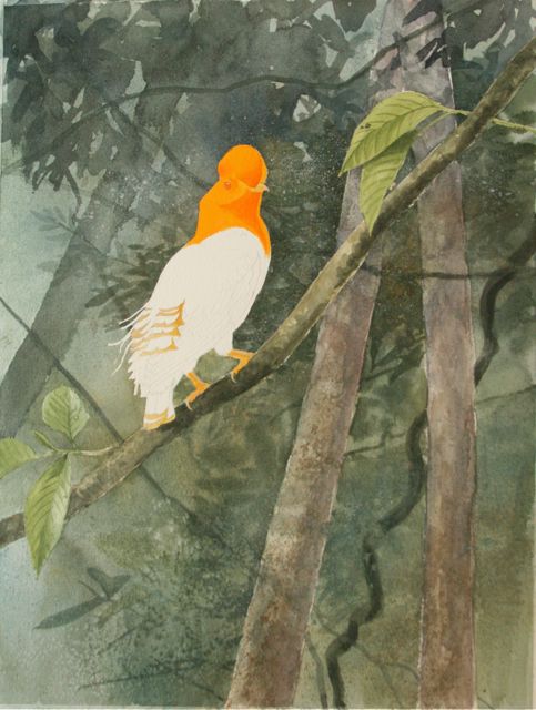
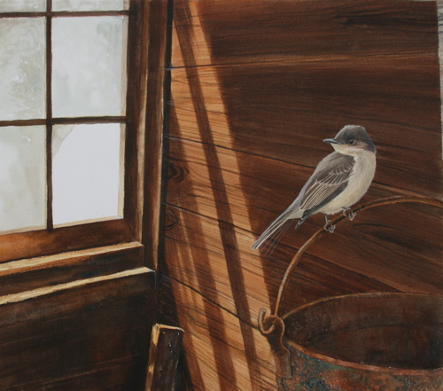
We're not done with Guyana, not by a long shot. But I need a little break, because I've fallen behind thanks to the Christmas madness. So the next three posts are about painting.

I'll tell you a secret. Since I've started blogging, since photography and daily exercise of my writing muscles have taken increasing prominence in my creative life, I haven't painted very much. In fact, I've probably painted less in the last two years than at any time of my life. Complaining? Nope. Just pointing it out. I'm happy with what I am; my creative output is as high as ever; it's just in a different form than before. I'm thinking more in terms of commentaries and essays and photos than in drawings and paintings these days.

Having admitted that to myself, accepted it, and found no shame in it, I still love to paint. It's just harder to work up to it. I'm sure you creative souls out there know exactly what I'm saying. You think, "Well, today I'll start that painting." (Substitute whatever significant creative endeavor you wish for the word "painting.") And then you look, and the orchids all need to be repotted. Or the studio's a mess, and you can't work in a mess like that. Or you need to vanquish a huge clothes monster lurking behind the bedroom door. Or...whatever you can come up with. I've used all those excuses and more.

What's behind that avoidance behavior, at least on my part, is fear. Fear that I have lost it. Fear that I'll climb on the creative bicycle and have a horrible wreck, a tangle of rubber and metal. Mistrust of myself, my own power to make something however I want to make it. It's stupid, it's a huge waste of time, but it does tend to get the house cleaned and the trash gathered and the laundry baskets emptied. And it also gets me a blocked up soul.

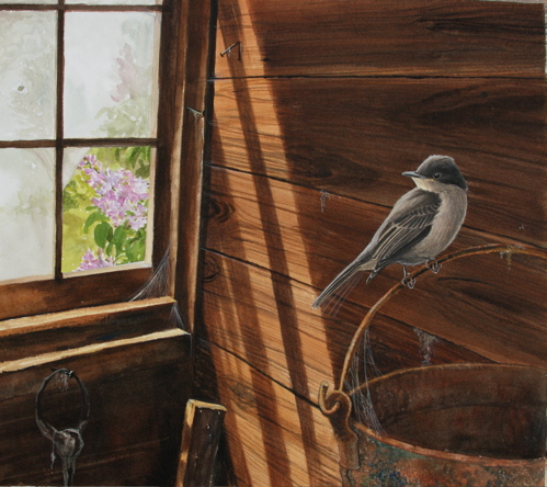
So I put off starting this painting for weeks, until it got close to when it was due (early December). It's a commission, a secret Christmas present for a Florida fan of Letters from Eden who also happens to be a photographer, commissioned by her fiancee. One of the nice things about painting on commission is that you meet the nicest guys, who want to surprise their girlfriends or wives with something you've painted just for them.

By the way, he couldn't wait until Christmas to give it to her, so I'm not spoiling anything here.

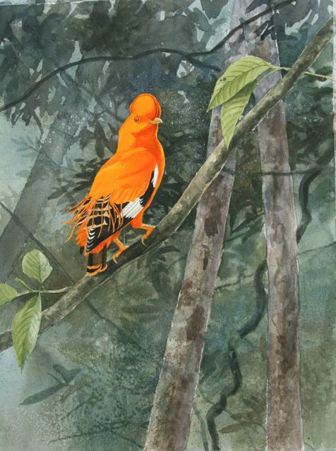
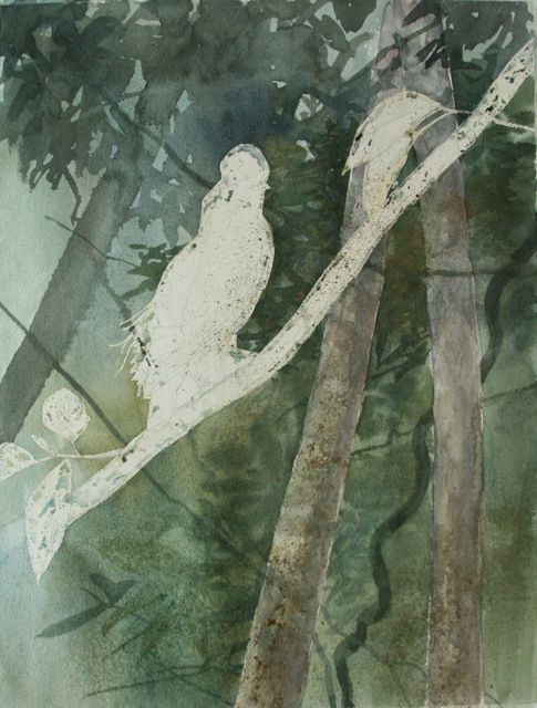
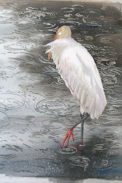
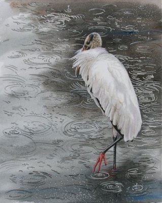
Commissions get me off my creative duff. I had no more excuses. So let's paint a wood stork in the rain, shall we?
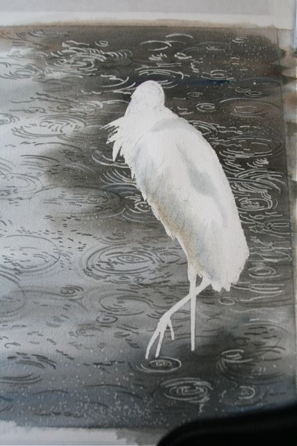
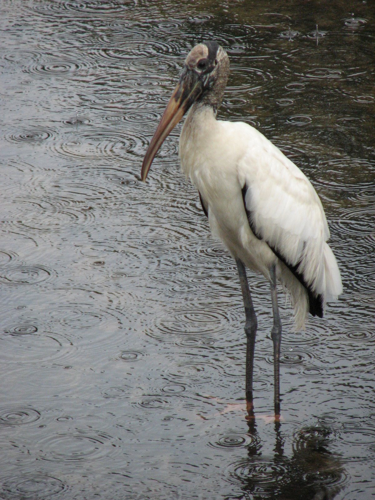
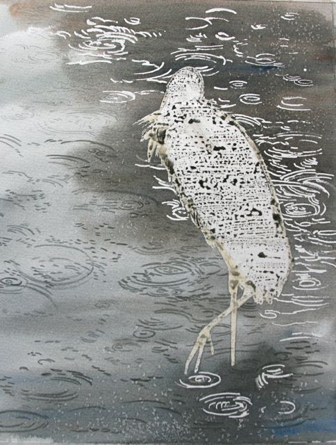
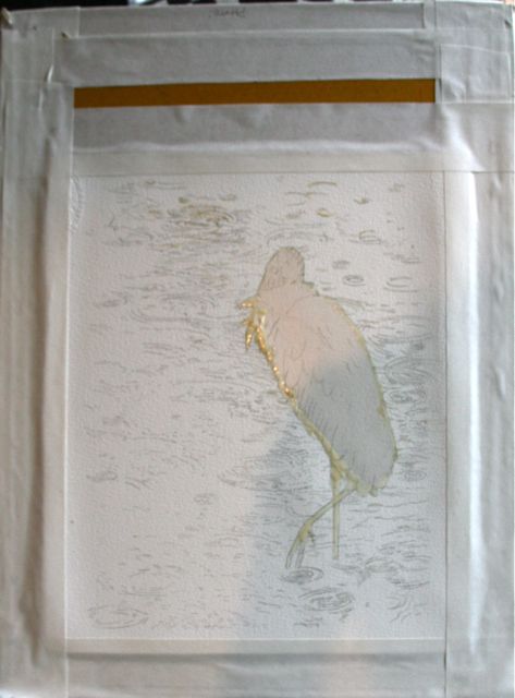
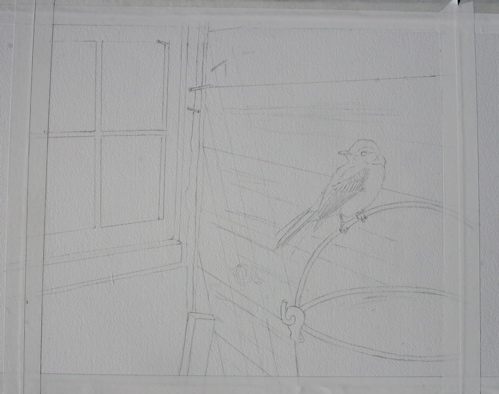
This was a private commission with very specific parameters. The commissioning party wanted a painting of a wood stork in the rain. Nice subject, moody; maybe a bit challenging. I had to make sure my raindrop spatters were convincing, and aligned right for the plane of the water, yet pleasingly random. I relied heavily on a photo by the surprise giftee of rain spatters on water for that, and transferred each little set of rings to the watercolor paper in pencil.

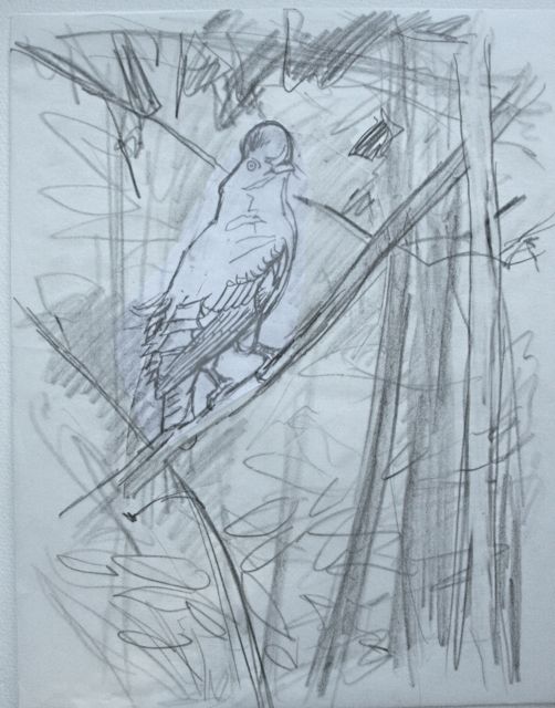
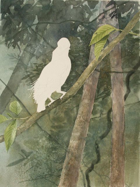
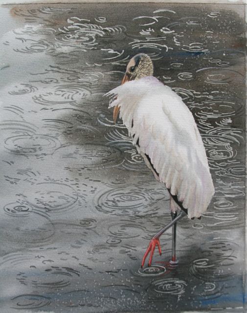
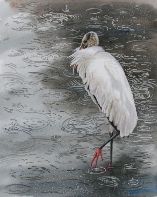
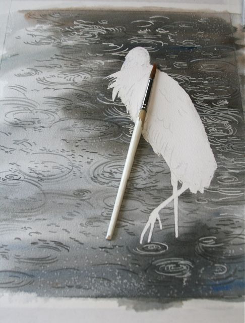
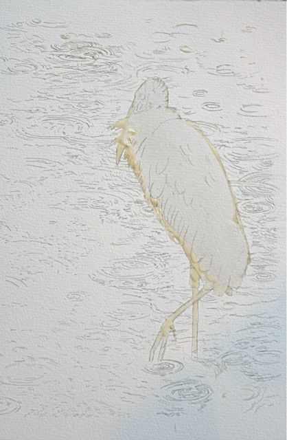
I wanted the bird to enhance the mood of solitary reflection, maybe tinged with loneliness. I wanted it to be at rest, yet alert, on the verge of changing position. So I puffed out its neck feathers as if it had been sleeping awhile, but raised one foot as if it were about to take a step and break that solitude. There was another reason I wanted to show a foot, which should be obvious in the first image in this post.
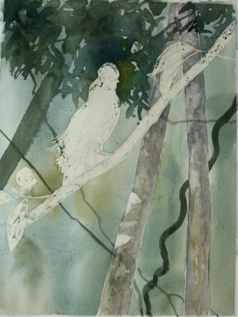
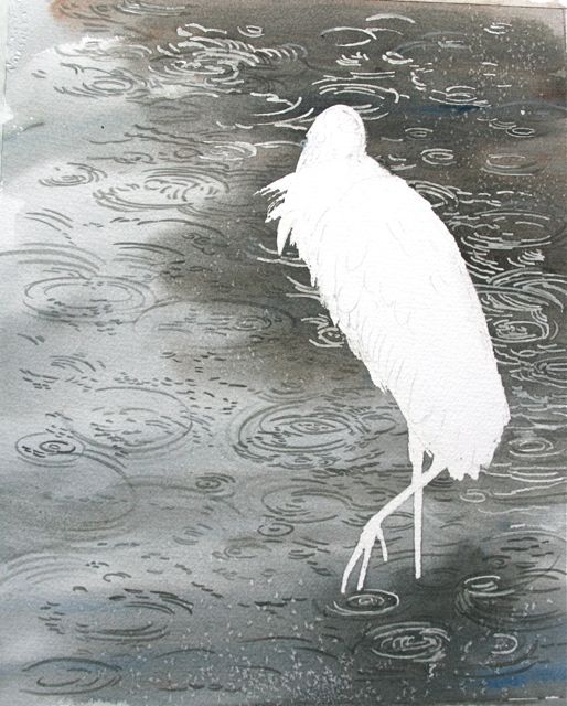
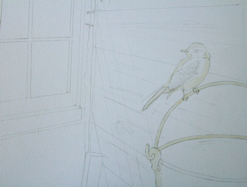
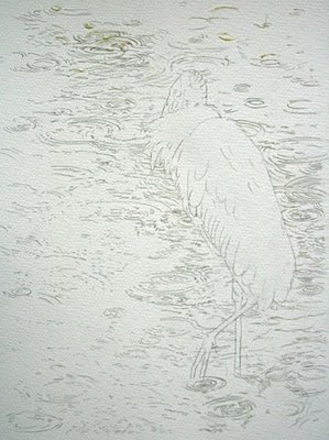
I cut the shape of the stork, which is white, out of masking film, and sealed the edges with liquid masking compound (I use Incredible White masking compound, a rubber cement-like liquid that dries to a tan rubbery finish). This would allow me to paint a nice runny wash over the whole page without worrying about going around the bird's shape.

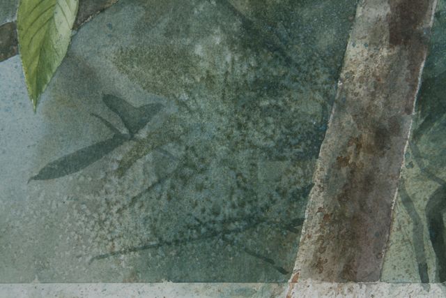
While I was at it, I painted some of the ripples on in masking liquid, because they would be lighter than the dark ground of the water.

And remembered that I had forgotten to stretch the sheet of watercolor paper before starting my work. These things happen when you haven't painted for two months. So I sprayed the back of the sheet with water, laid it on a piece of particle board, and taped it down. It warped and bent and then as it dried it stretched taut, and was ready for my washes.
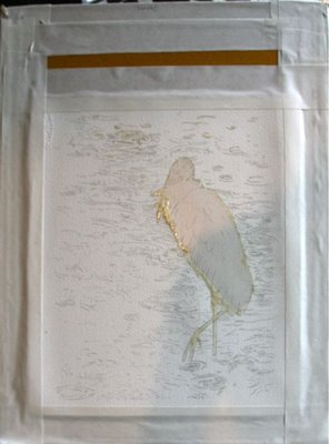
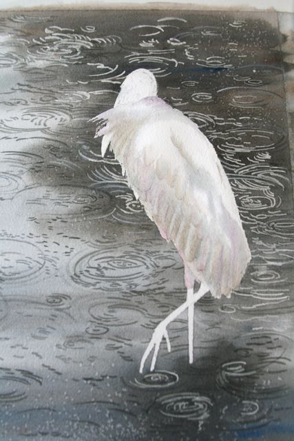
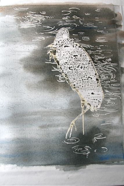
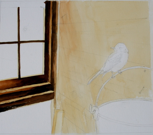
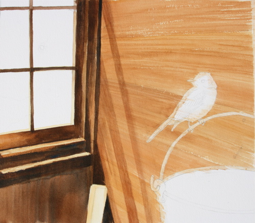
After all that prep, the fun part finally arrived. I sprayed the sheet down with water and laid in a nice juicy wash of cobalt blue and burnt umber, with a touch of German raw umber to give it an earthy cast. 
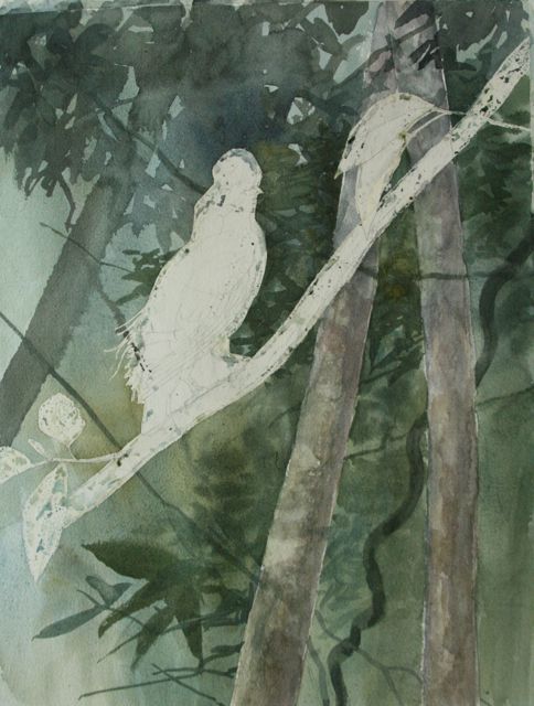
Now you can see how the masked ripples jump out. I masked the ripples only where the water was going to be dark. It was a little tricky figuring out how to do this, and I had to think about it for about a month before jumping in on it. At least that's what I told myself as I wiped counters and emptied trash.
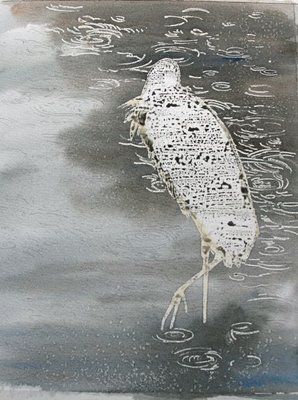
Couldn't resist sprinkling a little salt in the darker parts. Salt is hydrophilic, and it attracts water and repels pigment, resulting in little white sparkles wherever the grains fell.

In light colored water, the ripples appear as dark lines. In dark colored water, the ripples are pale lines. I had to figure out how to transition between the two zones of the painting, and make the whole thing believable.  Ninety percent of watercolor painting, at least for me, is in thinking it all out. I like to plan it, and figure out exactly what I'm going to do before touching brush to paper. You have to plan watercolor because you have to leave the white parts, either by masking them, as I've done, or by painting around them. You don't have the option, as you do in oil or acrylic, of painting a dark ground and then painting white areas on top of that dark ground. In watercolor, you paint from light to dark.

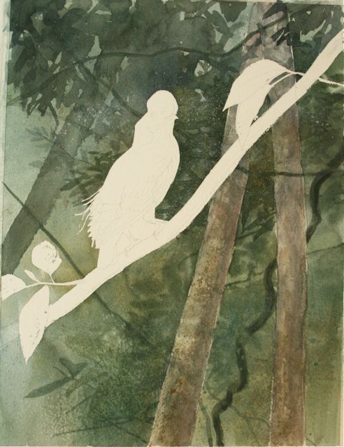
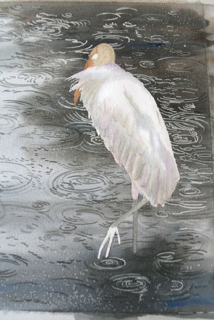
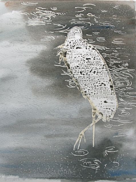
When all this dried, it was time to paint those ripple lines. After that, I'd peel the masking film off the stork shape and get going on the bird. Dessert!

Labels: , , ,

Sunday, January 27, 2008

An Offer I Couldn't Refuse

I've been saying for awhile that I wouldn't do any more illustration work. That I'd just work on my next book. But a statement like that needs to be qualified. Is it still illustration when you're given completely free rein to do whatever you want? Or is that a commissioned painting? I don't know. I just know that that's my kind of illustration job, baby!

Russ Greenberg is Director (and founder) of the Smithsonian Migratory Bird Center, whose mission is to help imperiled migratory birds through study, education and activism. At least that's how I'd describe their mission. From their web site:

The Smithsonian Migratory Bird Center bridges the academic, policy-making, and public worlds to coordinate efforts to protect migratory birds and their habitats. We bring public and policy issues to bear on our research--looking both at the way human-made changes affect bird populations and the way bird habitat preservation will affect human populations--and we translate our research findings into recommendations for public and policy action.


From the start, Russ has asked me to illustrate SMBC materials, from pamphlets to books to posters to Auk covers to booth displays. I've done pencil drawings, scratchboards, and paintings, and I've enjoyed every minute of it. Russ is ridiculously easy to work with and very appreciative of my efforts.

Here's how some of my watercolors were used for a booth display promoting shade-grown coffee:
The original oriole painting is a half-sheet of watercolor paper, maybe 11 x 16". I couldn't have imagined that, blown up to 8 FEET tall, it would look this good. I have to give due credit to designer Clayton Tompkins here. It's an inspired design. I would like Clayton to design my next kitchen, or house. I love everything about this booth. Russ says people just flock to it, because it's so visually appealing. And what a good cause--promoting shade-grown fair-trade coffee, which is good for coffee workers, coffee drinkers, and migratory birds, who love the habitat shade-grown plantations provide.

So when Russ e-mailed to ask if I'd be interested in doing a painting for SMBC's trade show booth, I listened. Here were the guidelines he laid out:

SMBC is doing a fancy new booth for all of the events and festivals we perform at. I know this is a total long shot. But is there any chance we can commission you for a painting for this? We want something that is face-melting in its beauty and captures the essence of what we are about. You are the one to do this, if you aren't totally booked...

He had me from "face-melting." Wait. Is this really work? To be asked to create something beautiful depicting birds, with no strictures on which birds or what the setting will be?

So I started thinking about migratory birds. It seemed only natural that the birds would be in flight. Up in the sky. So, having been completely enthralled with the skyscapes this autumn, I decided to put the birds against some really cool-looking clouds--my favorite--thunderheads against a blue sky. Yaaahh! Watercolor is just the medium to do that. Nothing like it for cirrus and billowing cloudbits, active sky washes and crisp edges.

I started taking pictures of every arresting cloudscape I saw. There were some doozies on the way to Ashland in September 07. You just can't get clouds like that in the winter. What a treat, to be able to paint something I love looking at so much.What birds to paint? It was wide open. I decided on a suite of birds which are imperiled, for many different reasons. Whether it be habitat loss on the wintering ground, habitat loss on the breeding ground, pesticide spraying in the boreal forests, clearcutting, destruction of food base, or loss of nesting sites, these birds are all in some kind of trouble. Bobolink seemed an emblematic grassland species, losing habitat faster than almost any species. Bay-breasted warblers are being hammered on the breeding grounds by pesticide spraying of spruce forests. Ruddy turnstones are having their migration food base (the eggs of horseshoe crabs) "harvested" right out from under them. And so it goes.

And then there was beauty. And the thrill of painting a hooded warbler next to a ruddy turnstone, a bobolink next to a scissor-tailed flycatcher. It didn't have to make any real sense; it's an allegory for beauty and courage in the face of peril. Such a delight to compose. I spent several days in the composition phase, always the most time-consuming. I had to draw the birds, make sure they were in scale to each other, and arrange them in a pleasing composition. Here's the first draft, just a bunch of paper birds taped together, shot on my sidewalk.One of the problems that arises when you're painting birds of widely disparate sizes next to each other is that of scale. If you've got a warbler next to a nighthawk, you've got to make sure the nighthawk isn't too big to paint comfortably, and the warbler isn't too small to paint comfortably. So, to get the warbler big enough so that I can see the detail, I've got to paint it about life size. And the nighthawk gets proportionately bigger. And before you know it, I've got a painting that's 21 x 30", a full sheet of watercolor paper, and that's a BIG watercolor.

Watercolors tend to be small because it's hard to control runny washes. Painting a full-sheet watercolor is like climbing atop an Irish thoroughbred, 17 hands tall, and taking it over a six-foot jump. It's not for the faint of heart.

I had the whole thing laid out before I left for my New England trip in October. I transferred the birds onto the blank paper, and left it to fly to Boston. There, I saw my family and my artist friends, for a whole delightful weekend. And there, I got the courage and inspiration to come home and paint this big old painting.


Labels: , , ,

Monday, April 09, 2007

Painting a Phoebe-Finis


All right. The wood's under control. Finally, I am ready to tackle the window view. I wanted a light, springy scene out there, and the best evocation of that-and of the antiquity of the scene-was a lilac. Better than that, the heirloom lilac from Bill's family farm. (The one that's all frozen crispy right now, all 50-plus blossom trusses pointing at the ground). I wanted the outside view to be flooded with light, in contrast to the barn interior. So I had to keep the hazy window glass quite light and bright, so it would be a believable source of the strong light flooding the room.
I love the idea of a single spot of riotous color in an otherwise three-color painting. I took the mockup pane off, enjoying the look of the painting before the real lilac went in. It could be a snowy day now, but for the ghost of a lilac in the middle right pane.
Before "dessert," I went back to further darken the bird, so it could believably sit in the dark barn interior. It was fun to play with the bird's colors, darkening and strengthening them, and yet still making the bird's underparts read as grayish white. On the painting, they're a medium brownish-purple!) I did this by darkening its upperparts accordingly. It is the contrast between upper and underparts that fools the eye into reading it as a gray and white bird.

Darker, darker, darker. Drama, drama, drama. I kept taking washes of ultramarine blue and a little Chinese white over the boards, which was a tricky thing to do now that the bird was in. Still needed to age those boards. The crud really helped, I think.

Almost shivering with anticipation, I readied myself to paint the lilac bit. In some ways, the lilacs are the most important part of the painting, more important than the bird, because they evoke the world outside, the possibility of the phoebe's life, in freedom outside the nesting barn. I don't want the lilacs to be photographic. I want them to be dreamy and drenched in sun.
So I paint fast and resist the temptation to get all carried away with detail.

I think it's done now. I'm calling it "The Missing Pane." Decrepitude is in the eye of the beholder. For phoebes, for barn owls, barn swallows, house and Carolina wrens, mice, snakes, bats, for me and many others, decrepitude's an open door, an invitation.If you've enjoyed following the process of "The Missing Pane's" creation, and would like a memento for your wall, you can order a print of the painting with this link. There will be a limited edition of 300, and I'll sign each one (and inscribe it to someone special if you wish). Prints should be ready by late June. You can pre-order and get it before anyone else. The painting will appear on the cover of Bird Watcher's Digest's July/August 2007 issue, with an article about raising Avis and Luther, the orphaned phoebe babies, inside. See the June and July 2006 archives for the whole story. Phew. That's about as many links as you want in one paragraph, huh?
I would like to thank my studio assistant, Chet Baker. He kept me company, kept the kisses coming for a lonely painter, and only occasionally rui--ahem, enhanced-- a shot. He's convinced that any time a camera's out, he's going to be the subject. And thanks to you, for being here with me, and for all your nice comments and encouragement. I've never painted with an audience before. It's fun!

Labels: , ,

Sunday, April 08, 2007

Painting a Phoebe--Cobwebs and Crud


It's the morning of the third day of work. Now, I get to put the phoebe in. I don't really have that much to say about the process of painting the bird. I've been doing it for so many years that it happens very quickly. The only tricky part here is lighting it so it can sit believably in the scene. I'll talk more about that later. It's by no means done here, just blocked in to hold the space.

Back to the wood. I have a friend, Taff Roberts, who's a talented artist-woodcuts and writing-as well as being a housewright. Taff's from Wales. He showed me some of the woodgraining he's done while restoring old houses. In woodgraining, you take a surface that's bland and pointless, and you paint woodgrain on it until it looks like real wood paneling. It's not that hard. You use a broad brush dipped in different colors of paint, separate the bristles a bit, and run it horizontally over the surface, letting the brush bristles organically define the grain of your faux wood. This technique was used liberally in Victorian finishes, often on furniture made of wood without its own distinctive grain. It's clever, and it fools the eye amazingly well. This is what I did with this painting-make fake wood.Here, it's very important to keep the wood grain lines consistent, so that the board planes are believable. Because I had masked it with film and masking compound, I painted over the bird quite freely, making sure there were no zones around its shape that might suggest I'd had to paint around it. The single most important thing I had to do in creating depth was make the boards behind the bird consistent. Any perturbation in their lines would make them "lift off" and make them come forward, instead of staying back behind the bird. Now that the bird was in, there would be no more broad brush strokes over it!

Another really important thing in making the shadows believable is running the woodgrain through them, so you can see the grain running through both darkness and light. Of course, the grain lines are darker in the shadows, and lighter in the light, but they are what make you believe that that's really a sunbeam playing over the surface, or a deep shadow. It's the change in the color of the grain lines, and the fact that you can still see them in the deep shadow, that really fools the eye. In all the overpainting, I was careful never to touch my sunbeams. Wouldn't want to dull that bright,warm color down. But I worked on the shadowed wood a lot.

I kept struggling with it, though, because my wood looked too fresh and new. It looked like cedar, and I wanted it to look like aged pine. So I kept taking darker and darker washes over it, ultramarine blue, and finally Chinese white to gray it out a bit.

In fact, while the window looked cruddy and old, the whole right wall just looked too new. It was time for some cobwebs and crud. Up to this point, I'd painted everything transparently. Now, I got out my Chinese white, which is a color with some opaque body to it. I painted some of that nameless scuzz that hangs on barn walls-cobwebs and dust, I guess. I put some cobwebs in the corners. Fun!

Bill was working at home, so I kept taking the painting to him for suggestions. He caught a bunch of things-wavering lines, nuances of color that suggested that the boards were new rather than aged. I made sure the parallax was right (see the fixed seam above the phoebe's head? It was fanning out too much and that ruined the perspective) and took washes of ultramarine blue over the cedar-red boards to age them. A few well-placed rusty nails helped with the age factor, and more crud hanging from the cracks. The space underneath the window looked dull and blank to me, so I went foraging out in the garage to see what was hanging on its walls. Ahh. An old crusty, rusty snaffle bit that we'd dug up while turning the garden. It's just half a snaffle bit. This is a horse bit that has a joint in the middle. Sometime in the last century it rusted in half. While I was at it, I painted another fake panel of lilacs for the window and taped it on, to make sure the concept was holding. It looked good, especially with the hazy suggestion of more lilacs in the pane directly above it. Again, the perfect subject for watercolor.
You can see in this image that I've darkened the bird a whole lot. I'd think I had it dark enough, and then I'd step back and it was still too lit up. I kept running violet and burnt umber and buffy gold and ultramarine streaks into its breast to darken it. Once he was nice and dark, boom, he suddenly fit into the scene. Compare this image with the one immediately above it if you don't think that helped. It's hard to go and make yourself paint shadow colors over a bird whose "local color" is technically "correct," but in order to make him inhabit the shadows, I've got to paint him lavender and gray and burnt umber. And that's what's really FUN.

I saw a short film once about a Japanese couple who work together painting huge scenes on rice paper. She paints the figures, carefully constructing them, drawing their anatomy. And when she's done, he gets in there with great basins of wet paint and runs sloppy washes right over her carefully painted figures. She has to leave the room when he's altering her work. But she agrees that he improves the end product. That's the kind of tension that exists between the scientist in me (who knows what color a phoebe "is," or should be) and the artist, who knows that shadows have all the colors of the scene running through them, and knows how to inject mood into a scene. The scientist paints a correct phoebe, and the artist comes in, politely asks the scientist to get lost, and messes with the stage and the lighting.

Everything I'll do from here on out falls into the realm of fine-tuning. The painting is just about done, at the end of the third day. Got to make sure I don't get too carried away with cobwebs and crud. Just as I'm getting the hang of painting them, it's time to stop. Wouldn't want the phoebe to turn into Miss Haversham. Thanks to Big Stuff for your keen eye and helpful suggestions.

Labels: , , ,

Friday, April 06, 2007

Painting a Phoebe, Part 2


I've mentioned the concept as being paramount in making a painting. Maybe it's the illustrator in me. I've been illustrating since 1976, and I can't help but tell some kind of story with my paintings. So I had this concept of a phoebe in a barn that just had to get out. As I worked on the painting, it became clear that there would have to be some way for the phoebe to get in and out of the barn in which it was perched. How to do that? Break a pane out of the window, of course.

It was a little alarming that I hadn't considered that before, but my mind was all filled up with windowpanes and sunbeams, and I hadn't had time to think about how the phoebe might have gotten inside the barn in the first place. And obviously, he'd need a way out, too. So I decided to knock a windowpane out. But which pane?

This is where watercolor can be a challenge. You have to know exactly what you're doing. You have to plan. You can't really paint an intact window in transparent watercolor and then decide to go and break a pane out of it. So I took another piece of paper, painted some sample panes and broken places on it, and taped it to the painting. This way, I could try out some ideas before committing them to paint.
Two panes (plus a bullethole) seemed like overkill. It would look better with just one pane out. The lower right pane seemed the best choice, compositionally.

As I looked out my studio window, I could see my favorite lilac, about to bloom. What heaven, to look out and see that. I decided that the glimpse of the outside world would be my heirloom lilac, bathed in sun, blooming its head off. I painted a little panel on a scrap of watercolor paper and taped it to the painting. Good. I like that. I painted the study on a day when it was in the upper 70's. By the next day, it had dropped to 22 degrees, and it's clear to me now that my heirloom lilac will not be blooming this year at all. I am sick about it, but there's nothing you can do about a crispy, wilted, translucent lilac. You just have to suck it up and hope the thing lives another year, having had its entire first flush of leaves and blossoms frozen smack off. April. Pah.

The copper bucket was next. Apologizing to the Carolina wrens, I got a stepladder out and lowered the ancient holey bucket they nest in under the eaves. I put it up there for them four years ago, and they've nested in it ever since. I carefully removed their nesting material-not yet renewed for the season-and dumped out the dust, feather sheaths and blowflies that had accumulated over the years. Took the bucket inside and painted it. An hour later, while I was still working on the bucket, I went outside to photograph the painting and a pair of Carolina wrens scolded and sang and made it very clear that I was to replace the bucket the moment I was done with it. Message received.
You can see that, having made my decision about the windowpane, I've removed the sample panel and left the window blank again. Time to focus on the copper bucket.
Here, on the bucket, salt was my friend. I wanted a scrofulous finish, with Paris green and rust and oxidation creeping over it. I doused the surface with strong pools of dark pigment, then sprinkled table salt onto it. The salt would attract the water, and leave little pools of pigment wherever it had settled. Kosher salt would make larger sparkles, having larger grain. I used both. The bucket was a snap to paint, after I peeled off the masking compound.
I've peeled off the phoebe's masking compound too. Believe it or not, this is just the end of the second day. I told you a lot happened that second day. I've got the wood pretty much under control, the bucket painted, and the windowpanes started. I like the way the light is coming in. It's believable. Believable light is the single hardest thing to do in any painting, as far as I'm concerned. You have to exaggerate it so much to get it across at all...I'm saving the phoebe for dessert. I've also got a job ahead of me in ageing the wood behind the phoebe. Right now, it looks like fresh-milled cedar, and I want it to look like old, old pine. The stuff of much thought, consideration, and many overwashes. At least the light is happening. To be continued...

Labels: , ,

Thursday, April 05, 2007

Painting a Phoebe

As those of you who've been with me for the past year know, eastern phoebes are special birds for me. In several of the springs of my life, I've done a phoebe painting. Phoebes move me, enough to have named our firstborn for one, enough to make me paint pictures of them that have something to say about the stages in my life. And last summer, with a lot of help from Phoebe, I raised two orphaned phoebes: Avis and Luther.On March 13 of this year, a phoebe showed up singing in the yard. He sang around the garage and the back deck. When I walked out to the driveway, he flew to a low branch on the ash tree that hangs over the pavement. Hmm. The same branch Luther used to go to when he wanted to be fed. When I moved closer, calling his name, he didn't retreat, but kept chipping and wagging his tail. From there, he flew to the birch tree that overhangs the birdbath where Luther drank and bathed. It was a favorite hangout. I have no proof it was Luther, but I felt I knew him, and it seemed he knew me. He certainly wasn't skittish around me. Time will tell; if the weather lets up (it's in the 20's today) perhaps this bird will decide to stay, and one fine day come in to a Pyrex plate full of mealworms. That would be something fine.

Clearly, it was time to paint a phoebe again. I thought for a month or more about what I wanted to do with this painting. For me, the bird image is the least of it. The setting is everything. Ever since we were in New Mexico in November, I've wanted to paint a barn interior. I saw light streaming into adobe structures, old wood and sunbeams...Reading The Girl with the Pearl Earring, a fictionalized account of the Dutch master Vermeer's life, just enhanced that feeling. I wanted to play with light coming in a window. So I designed a scene that would incorporate some of the things I love most: a phoebe, a barn interior, and sun coming through a window.Here's the drawing, already transferred to the watercolor paper. The painting will be nearly a square at 13 x 14 1/2".

Because there will be a lot of darkness in the painting, it's going to be necessary to mask the bird and foreground perch (a copper bucket, also a beloved possession that dates from my early childhood in Kansas). Here, you can see the yellowish masking compound that I've painted on the bird and bucket to protect them from the dark brown washes I'm planning to lay down. Here, with the finished drawing, transferring it to watercolor paper, and masking it, my first day of work ends.Ohhhhh.....this is too much fun. I'll take you a bit into the second day so you can get a peek at how the painting will evolve. I decide to block in the window and the wall. The window has some of the darkest values in the painting, and I want to lay something really dark down so I can dial up or down from that as I build the rest of the scene. I put a sunny buff -yellow underpainting down on the wall, that will give me some of the lightest values.At this point, the inevitable depression set in. I should see it coming, but it always creeps up and surprises me. It's a stage I go through with every painting, even when it's going well. I become convinced that it is in fact a piece of crap. I think one of the reasons I love to write so much is that it's mysteriously free of that downcycle. When I'm writing, I just go.

I sank deeper into an unproductive despair, until I realized that the only thing that would fix me was going out for a walk. So Chet and I set out on the Loop, and a good soaking in 80-degree sunshine, a handful of butterflies and a deep draught of wildflowers was just what the doctor ordered. See yesterday's post!

Refreshed and recharged, smelling of sunshine and fresh air, I was ready to make the wall look like wood. Another couple of washes of burnt sienna, quinacridone yellow and burnt umber, and I got the plane laid down. It was no longer a flat field of color; it was lying in space the way it should. I painted in some of the woodgrain and really felt the painting begin to take off.

Here's how it looked by the middle of the second afternoon. I kept painting until the light went away, and a lot more happened that afternoon, but this seems like a good place to stop. The painting is starting to look like something now. I hope from this you see that watercolor is not a medium over which one should linger and noodle. It takes nerve and speed, and if you're working well, it really doesn't take long to make something out of nothing. In the end, that may be my favorite thing about it. That, and the luminosity, the way you can layer one wash on another but still see the first wash, and the way the paint feels, flowing out of the brush. OK, there's nothing I don't love about watercolor.

Tomorrow: sunbeams, more wood, and a bucket.

Labels: , ,