Painting a Stork
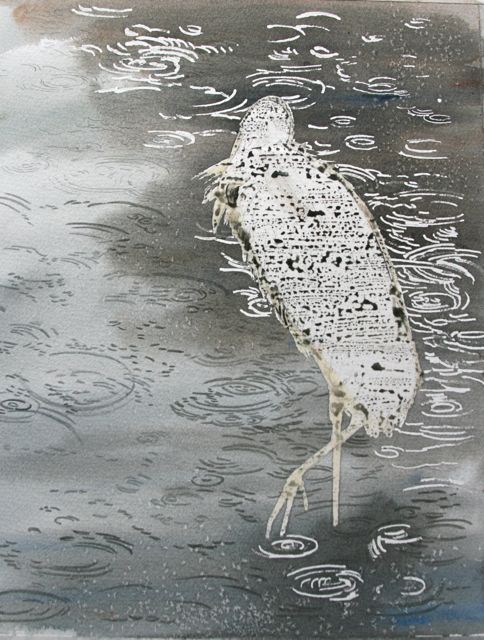
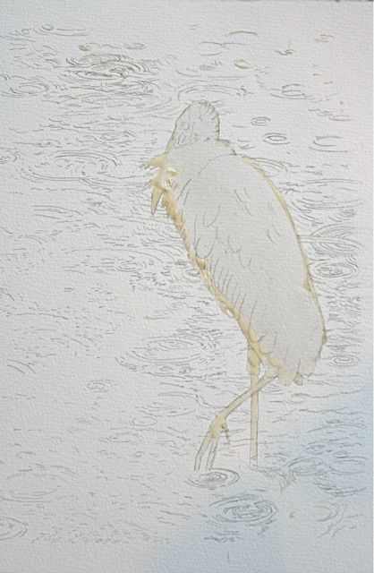
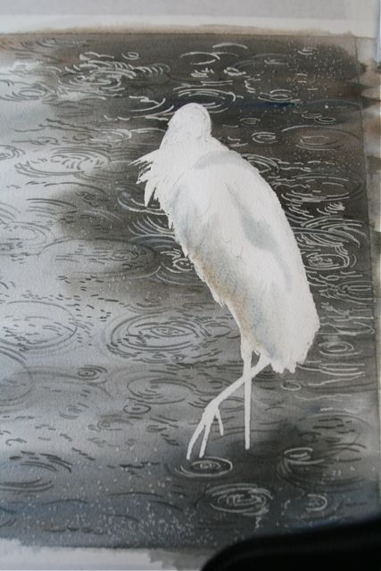 Oh goody! I get to paint the bird now! While the stork's body was wet down with clear water, I fed some of the same colors found in the water--burnt umber and cobalt blue--into that clear wash. I wanted the colors to diffuse so there would be no hard edges on the white plumage.
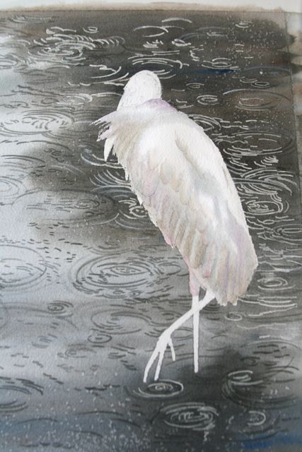 You might be thinking at this point that the bird looks kind of dirty. Me, too. Most wood storks I've seen look dirty to start with, but that's beside the point. Oddly enough, you have to overpaint white birds a bit to make them look white, if that makes any sense. Or at least to make them look rounded and not flat. White is a color that picks up color from everything around it. You can do all kinds of dirty work in the shadows of white, as long as you keep the highlights bright white. If you keep the highlights clean, the whole thing will read as white, (almost) no matter what you do in the shadows.
White is a negative space, and other colors rush in to fill it. They reflect on white; they fill it up. White is such fun to paint.
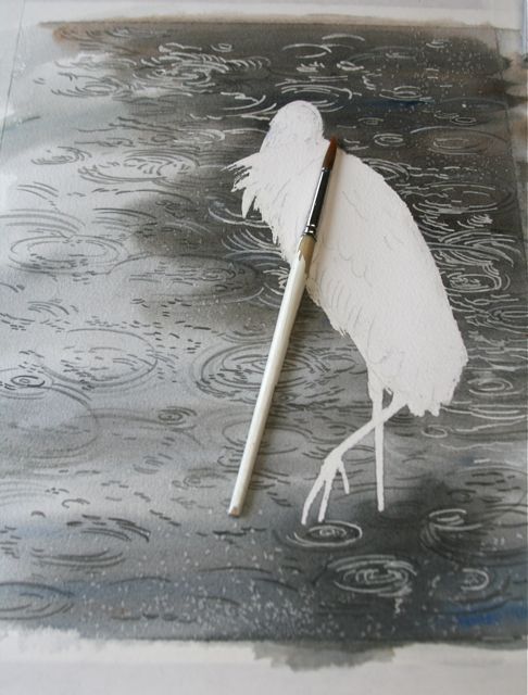
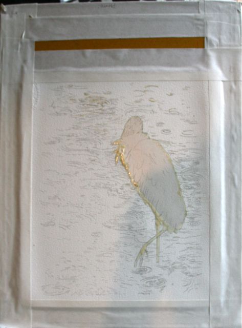
I started painting in head, bill and legs.
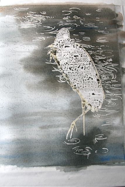
 And the darker those bits got, the cleaner the bird looked. Put dirty white against black and it suddenly looks bright and clean. And now you see why I wanted the bird to raise its foot. I couldn't resist that shrimp-pink appendage, so unexpected in such a somberly colored bird.
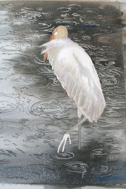
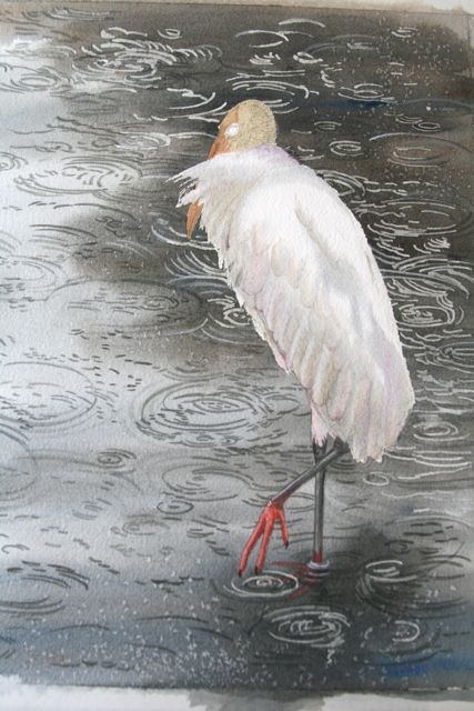 Let's work on that head, and trick in the black edge of the flight feathers along the underside of the stork. Ahh. Now the white looks white again. Isn't that cool beyond cool?
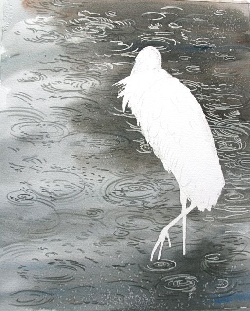
Some of those ripples in the background are still a bit aggressive, a bit too bright, and I think they're fighting with the bird.
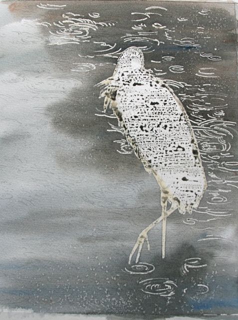
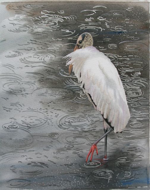 So I calm them down with some more gray-blue washes, and paint over an annoying squiggly one under the bird's back leg with dark gray. Time to sign it.
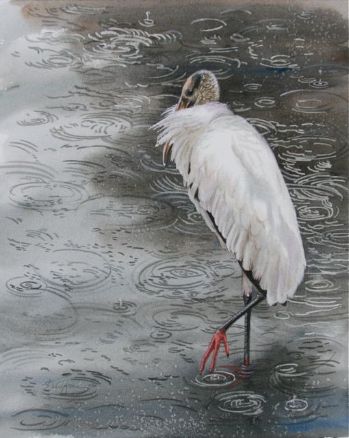
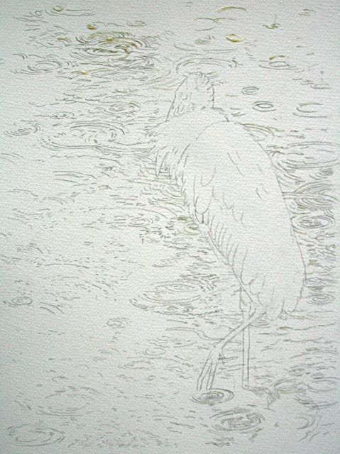
Let's have another look at that reference photo. You might be interested in my thought process on the stork. Although it's a lovely photo, I thought it lacked a bit in mood, due to the fact that the stork is on alert and facing the viewer. He looks a little tense, and facing front, he blocks the viewer from entering his world. He looks like he's challenging you, and deciding whether to fly off. As I thought about it, facing the stork more into the scene would help the viewer enter, and make the bird less confrontational. I also wanted to put the stork in a quieter, more reflective mood, so I pulled his head in and fluffed his feathers out. I very nearly closed his eyes but in the end I didn't want to remove that point of contact with the viewer.
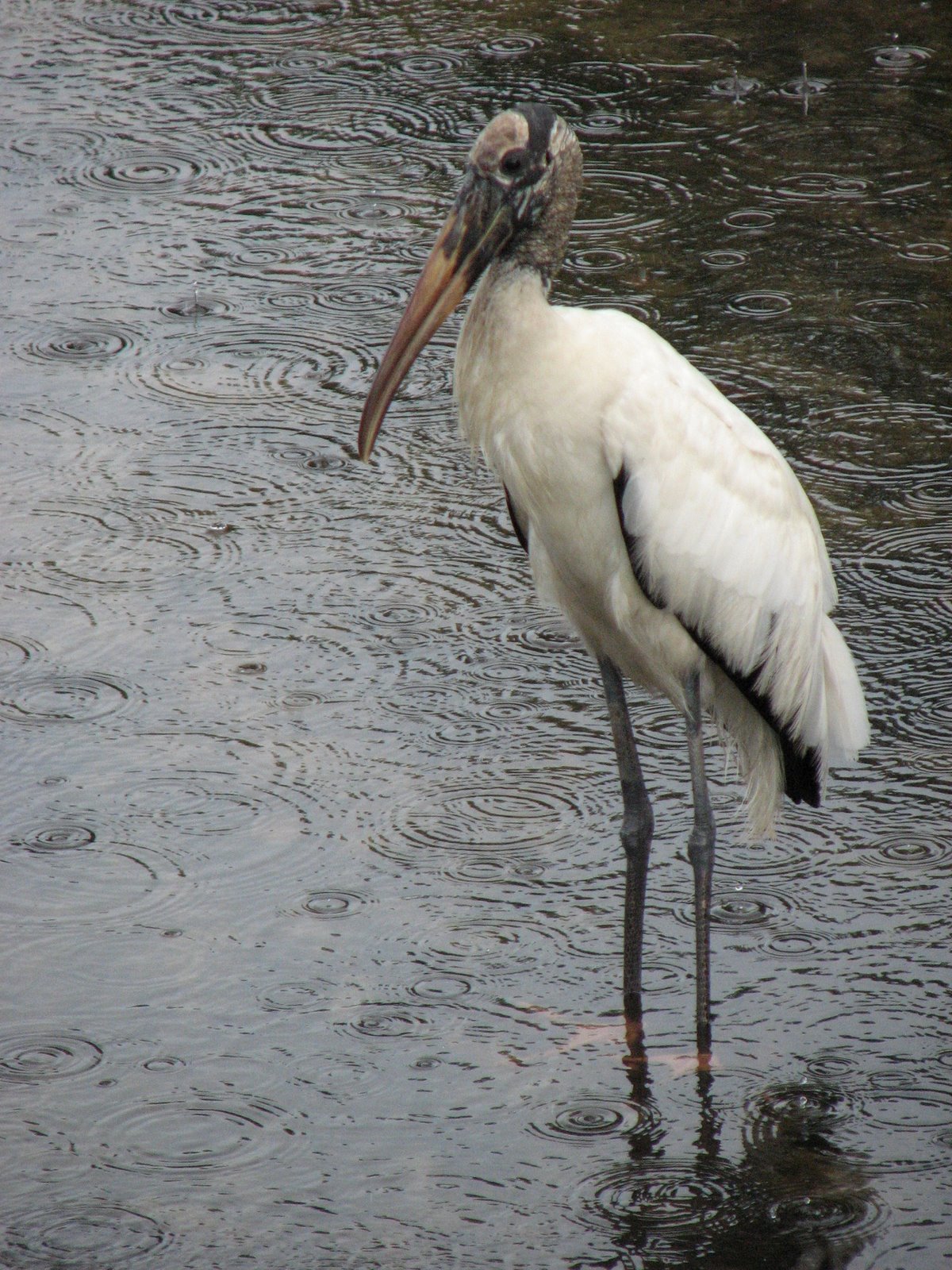
The result is considerably simplified from the photo; fewer little rings and droplets, the stork in a more peaceful and contemplative attitude. It's not raining quite as hard in my painting as in the photo, is it?
I like what watercolor does with water. The diffusing wet-on-wet wash gives it a painterly magic that a photo (or a slavish rendering of a photo) can't achieve. I could see the shrimp-pink foot underwater and couldn't resist raising it for a peek. I haven't necessarily improved on the photo, but I've made a painting of it with the filter of my brain. I took the commission in August, but I wasn't really ready to paint it until November, because thoughts like how to enhance the mood of the scene, how to draw the viewer in, and how to render the raindrops don't come quickly to me.
I think it's done. I don't want to overwork it. All told, I've spent one day's work on the drawing and preparation (transferring and masking); one day on the water and a day on the bird. And oh, three months on the thinking part. I do the hard stuff first and save the most fun stuff for last. It's kind of a reward system.
Net result: Money to put toward groceries and gas, happy clients, and a temporarily unblocked creative spirit. I didn't lose it; it was always there, but it seems I have to prove that to myself again and again.
Oh--the recipient loved it. Here's an excerpt from the sweetheart of a guy who commissioned it:
"I’d been teasing that her big gift was going to blow her mind, so after exchanging all the other gifts I had her close her eyes while I went upstairs to retrieve the BIG present that had been hidden unbeknownst to her in her closet the whole time. Played the eyes-closed game, had her open them, and…
"One of the things about gift-giving is that you know what the gift is and the recipient does not –as such, seeing someone look at something the first time, you can see the thought process play out in real time:
1. What is...
2. What the…
3. Oh my, this is just…
4. Oh wow…
5. WOW…
6. Hey, wait, this looks like…
7. HOLY &*(&^!
8. Wait a…HOLY &*&*^@!
And that’s pretty much how it went, and I got to watch it, and it was perfect."
Giving gifts is so much better than receiving, isn't it?
Love ya, mean it,
JZ
Labels: creating mood in watercolor, painting step by step, Watercolor painting, wood stork

posted by Julie Zickefoose @ 3:38 PM
![]()